The Hidden Persuaders: The Psychology of Web Design and What Makes Users Click, Scroll, and Buy
Ever landed on a website and felt instantly comfortable, intuitively knowing where to go next? Or perhaps you’ve felt inexplicably compelled to click a button or sign up for a newsletter? That’s not just luck or good aesthetics – it’s often the subtle power of web design psychology at work.
Effective web design goes far beyond pretty pictures and cool fonts. It delves into understanding how human minds perceive information, make decisions, and react emotionally. By tapping into these psychological principles, designers and businesses can create experiences that don’t just look good, but actively guide users towards desired actions: clicking, scrolling, and ultimately, converting.
So, what are these hidden persuaders? Let’s break down some key psychological concepts influencing user behaviour online:
1. Visual Hierarchy & Attention: Guiding the Eye
Our brains are wired to seek patterns and prioritize information. Visual hierarchy uses design elements like size, color, contrast, and placement to direct the user’s attention to the most important elements first.
- Why it works: We naturally scan pages in predictable patterns (like the ‘F’ or ‘Z’ pattern). Designers leverage this by placing crucial calls-to-action (CTAs), headlines, and value propositions in these high-visibility zones.
- Impact:
- Clicking: Prominent, contrasting buttons in key locations are more likely to be noticed and clicked.
- Scrolling: Clear headings and well-structured content encourage users to keep scrolling down, confident they’ll find what they need.
2. Cognitive Load & Simplicity: Don’t Make Me Think!
Cognitive load refers to the amount of mental effort required to process information. If a website is cluttered, confusing, or requires too much effort to navigate, users will experience high cognitive load and likely leave. Simplicity is key.
- Why it works: Our brains prefer the path of least resistance. Clean layouts, intuitive navigation, and concise text reduce mental strain, making the experience pleasant and efficient.
- Impact:
- Scrolling: Easy-to-scan content with ample white space reduces overwhelm and encourages exploration.
- Buying: Streamlined checkout processes with minimal steps reduce friction and cart abandonment.
3. Social Proof & Trust: The Power of the Crowd
Humans are social creatures. We look to others for cues on how to behave, especially when uncertain. Social proof leverages this tendency by showcasing evidence that others trust and value your product or service.
- Why it works: Seeing testimonials, reviews, user counts, client logos, or media mentions builds credibility and reduces perceived risk. It signals “others like this, so maybe I will too.”
- Impact:
- Buying: Positive reviews and testimonials directly address potential objections and build the trust needed for a purchase decision.
- Clicking: Seeing “Join 10,000 happy customers” can be a powerful motivator to click a sign-up button.
4. Color Psychology: Setting the Mood and Driving Action
Colors evoke emotions and associations. While cultural differences exist, certain colors tend to have common psychological impacts (e.g., blue often conveys trust and security, red urgency or excitement, green growth or positivity).
- Why it works: Color choices influence brand perception and can subconsciously guide user feelings and actions.
- Impact:
- Clicking: Using action-oriented colors (like orange or red) for buttons can make them stand out and prompt clicks (when used strategically).
- Buying: Consistent brand colors build recognition and trust, while specific colors in the checkout process can reassure or create urgency.
5. Scarcity & Urgency: The Fear of Missing Out (FOMO)
These principles tap into our aversion to loss. Highlighting limited availability (scarcity) or a time-bound offer (urgency) motivates users to act quickly.
- Why it works: FOMO is a powerful driver. Phrases like “Only 3 left in stock!” or “Sale ends tonight!” create pressure to make a decision before the opportunity disappears.
- Impact:
- Buying: Directly encourages immediate purchase decisions.
- Clicking: Prompts users to click on limited-time offers or learn more about scarce items.
6. Hick’s Law: Less is More When It Comes to Choice
Hick’s Law states that the time it takes to make a decision increases with the number and complexity of choices. Too many options can lead to choice paralysis, where the user feels overwhelmed and makes no decision at all.
- Why it works: Simplifying choices reduces cognitive load and makes the path forward clearer.
- Impact:
- Clicking: Clear navigation with fewer main options helps users find what they need faster. Offering one primary CTA per section is often more effective than several competing ones.
- Buying: Presenting fewer, well-defined product options or package tiers can lead to higher conversion rates than an overwhelming catalogue.
7. Familiarity & Mental Models: Meeting Expectations
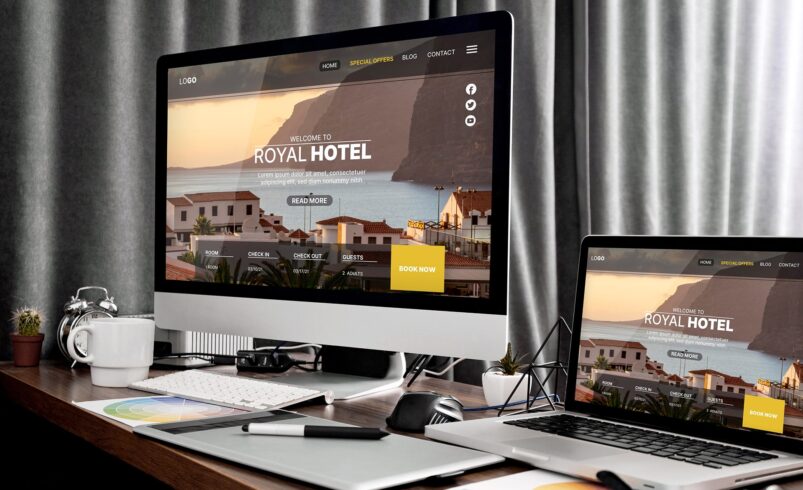
Users arrive at your website with pre-existing expectations based on their past online experiences. These mental models include conventions like the logo being in the top-left, navigation across the top, and a shopping cart icon in the top-right.
- Why it works: Sticking to familiar patterns reduces the learning curve and makes the site feel intuitive. Violating strong conventions can cause confusion and frustration.
- Impact:
- Scrolling & Clicking: Users can navigate confidently and find information easily, encouraging deeper engagement.
- Buying: A standard, predictable checkout flow builds trust and reduces anxiety during the purchase process.
Designing with the User’s Mind in Mind
Understanding the psychology behind web design isn’t about manipulation; it’s about empathy. It’s about creating user experiences that are intuitive, efficient, and enjoyable by aligning design choices with how people naturally think and behave.
By thoughtfully applying principles like visual hierarchy, simplicity, social proof, and color psychology, you can create websites that not only capture attention but also effectively guide users towards clicking that button, scrolling for more information, and ultimately, making that purchase.
Next time you browse the web, pay attention. Can you spot these psychological principles at play? And more importantly, are you using them effectively on your own site?
Want to apply these principles to your website? Explore our web design services.